8 Old Logos That Faded Without A Trace And 8 Retro Designs We Still Miss Today
Logos are like the celebrity faces of our favorite brands—always there, silently judging us from cereal boxes and soda cans.
I’ve always been obsessed with how these little visual masterpieces evolve, like Pokémon, but with fewer lightning bolts and more Helvetica. Some logos vanish into the design graveyard, never to be seen again (RIP old Pizza Hut roof), while others haunt our dreams with their glorious retro charm.
I mean, who decided everything had to look like a tech startup now? Walking through the grocery store feels like flipping through a minimalist art gallery curated by someone who hates fun. Gone are the bold, bizarre, overly enthusiastic logos of the past—replaced with sleek, sterile cousins that whisper “I’m very modern and slightly boring.”
So let’s dust off our mental filing cabinets and revisit some forgotten emblems and design classics that still make our hearts skip a nostalgic, slightly neon-colored beat.
1. Aunt Jemima’s Problematic Past
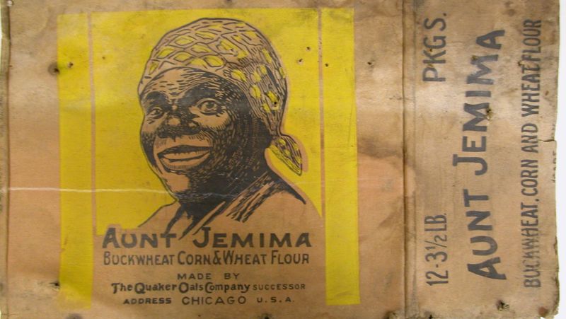
Growing up, I’d watch my grandmother make pancakes with Aunt Jemima mix, never questioning the smiling face on the box. The logo, based on a racial stereotype, was once ubiquitous in American kitchens.
In 2020, after 130 years, PepsiCo finally acknowledged the harmful imagery and retired the brand completely. The company rebranded as Pearl Milling Company, erasing all traces of the former identity.
What’s fascinating is how quickly such a recognizable symbol can vanish from cultural memory. Within just a couple years, younger generations may never recognize what was once a staple in breakfast aisles across America.
2. Uncle Ben’s Quiet Transformation
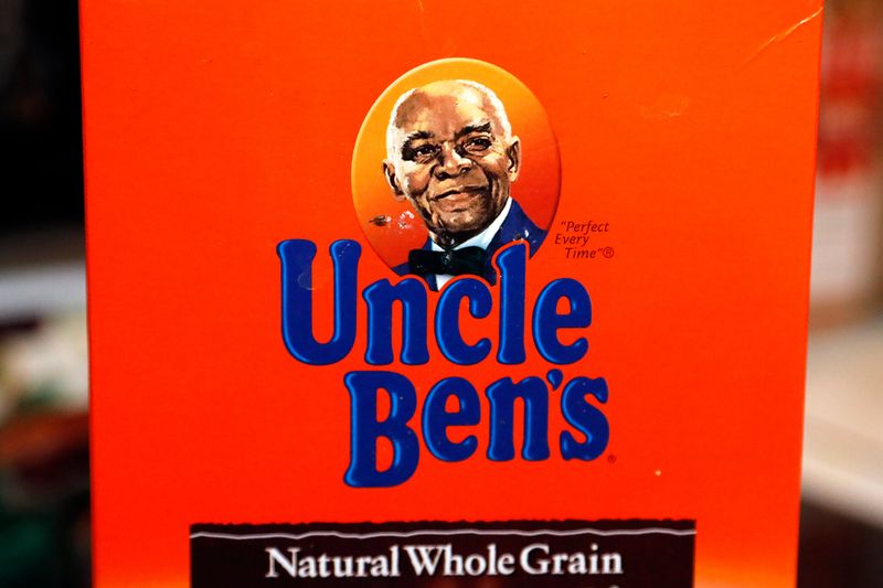
Remember Uncle Ben smiling at you from the rice aisle? I certainly do! His portrait adorned millions of rice packages worldwide since 1946, becoming one of the most recognizable food logos ever.
Mars Food finally acknowledged the problematic racial stereotype behind their mascot in 2020. Without much fanfare, Uncle Ben disappeared and was replaced by Ben’s Original, dropping both the image and the ‘Uncle’ title with its uncomfortable connections to how enslaved men were addressed.
What amazes me is how such a globally recognized symbol could vanish so completely. The transition happened with such surgical precision that many consumers barely noticed the change.
3. Cream of Wheat’s Chef Rastus Controversy

My grandmother’s pantry always had that distinctive Cream of Wheat box with the smiling Black chef. Little did I know as a child that ‘Chef Rastus’ (as he was called) represented a deeply problematic racial caricature dating back to 1893.
The chef image was based on a Chicago chef named Frank L. White, but the character was portrayed using offensive stereotypes. B&G Foods finally removed the chef from packaging in 2020, responding to growing awareness about racial insensitivity in branding.
What’s remarkable is how this image survived for over 125 years before finally disappearing! The brand now features a simple steam swirl, erasing all traces of its controversial mascot.
4. Kodak’s Forgotten First Emblem

I stumbled across an antique Kodak camera at my grandfather’s house, sporting a circular monogram logo I barely recognized. Kodak’s original 1907 emblem – a fancy ‘EKC’ monogram inside a circle – bears almost no resemblance to anything we associate with the brand today.
The company’s earliest identity vanished so completely that even photography enthusiasts might not recognize it. Kodak shifted through various designs before settling on the red and yellow ‘K’ wordmark that dominated the film era.
Fascinating how a brand that documented our memories had its own visual history erased! This elegant emblem disappeared so thoroughly that finding examples today requires serious digging through photography archives.
5. Land O’Lakes’ Native American Maiden
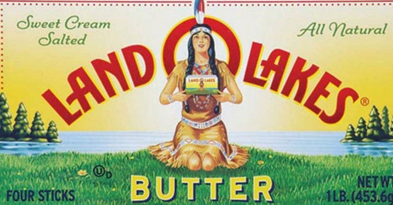
The butter of my childhood featured a Native American woman kneeling on green grass, holding a box of Land O’Lakes butter (which itself featured the same image, creating that infinite mirror effect that fascinated me). This logo, created in 1928, was a fixture in refrigerators nationwide.
In 2020, Land O’Lakes quietly removed the Native American woman from their packaging. The redesign kept the lake and trees but eliminated the controversial figure entirely.
What’s striking is how little publicity surrounded this major change. A character that had represented the brand for nearly a century simply disappeared, replaced by the landscape alone, while most consumers barely noticed the transition.
6. Washington Redskins’ Controversial Symbol
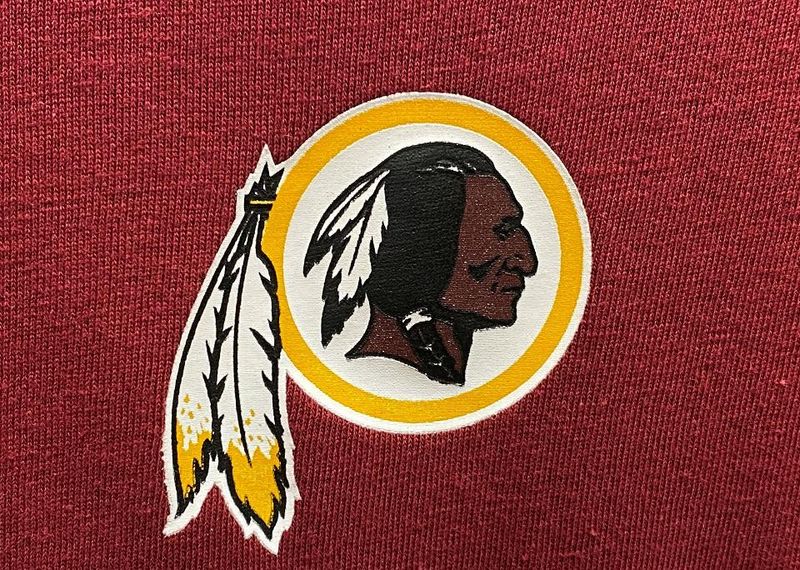
Sunday football at my house always featured that bold burgundy and gold logo of the Washington Redskins – a profile of a Native American with feathers. For decades, this symbol dominated merchandise, broadcasts, and stadiums despite growing criticism.
After years of pressure and corporate sponsor threats, the team finally abandoned both the name and logo in 2020. They temporarily became the ‘Washington Football Team’ before adopting ‘Commanders’ in 2022, completely erasing their former visual identity.
The speed of this erasure amazed me! Decades of merchandise, signage, and branding vanished almost overnight. What was once one of the most recognizable sports logos in America has been relegated to vintage collections and history books.
7. Cleveland Indians’ Chief Wahoo Removal
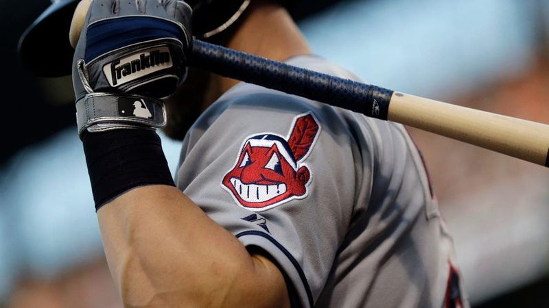
Growing up in Ohio, I saw Chief Wahoo everywhere – that cartoonish, red-faced Native American with a feather and an exaggerated grin adorned countless baseball caps and jerseys. This controversial mascot became increasingly recognized as an offensive caricature.
The Cleveland Indians (now Guardians) began phasing out Chief Wahoo in 2018, first removing it from uniforms, then merchandise. By 2021, the team completely rebranded to the Cleveland Guardians, erasing all official connections to the former identity.
What struck me most was the resistance to this change! Many fans clung to the old logo despite its problematic nature. Yet today, younger baseball fans might never recognize what was once an ubiquitous symbol in American sports.
8. Mrs. Butterworth’s Subtle Disappearance
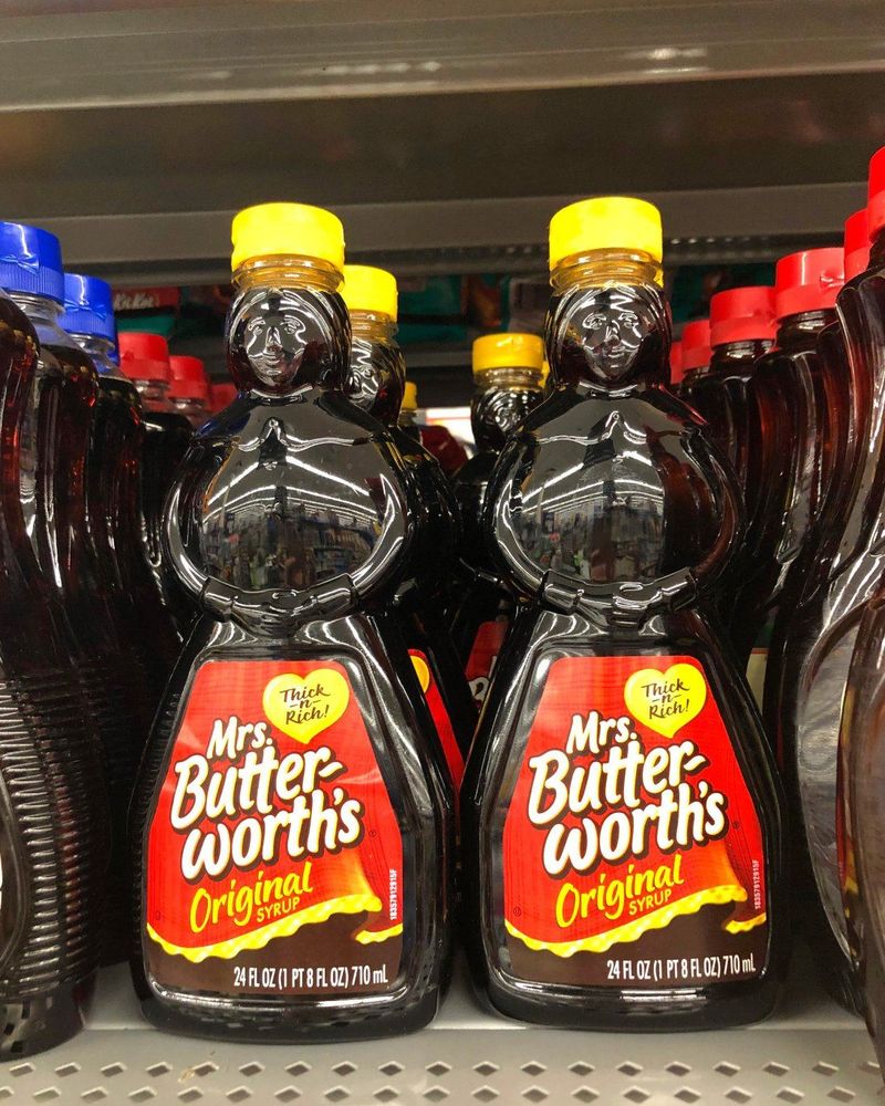
My favorite part of pancake mornings was turning Mrs. Butterworth’s bottle upside down, watching the syrup slowly ooze out of the motherly-shaped container. That anthropomorphic bottle, designed to resemble a grandmotherly figure in an apron, was introduced in 1961.
In 2020, Conagra Brands announced a complete review of the Mrs. Butterworth brand due to criticisms that it perpetuated racial stereotypes. The company quietly began phasing out the distinctive bottle shape.
What fascinates me is how this transition happened with minimal fanfare. Unlike other brand changes that made headlines, Mrs. Butterworth’s transformation occurred so subtly that many consumers didn’t even notice when the familiar bottle silhouette began disappearing from grocery shelves.
9. Apple’s Whimsical Newton Logo
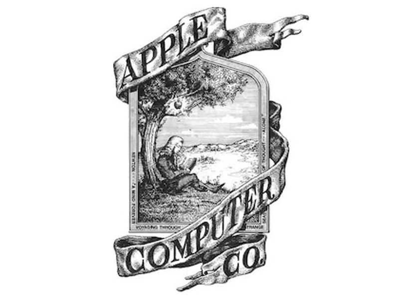
Few people know that before the iconic bitten apple, the company used an elaborate illustration of Isaac Newton sitting under an apple tree! I discovered this gem while researching tech history for a college project.
This intricate logo, designed by co-founder Ronald Wayne in 1976, lasted mere months before Steve Jobs commissioned the simpler apple silhouette. The drawing featured Newton reading beneath a tree with a loose apple dangling above his head, surrounded by a quote from William Wordsworth.
I’m still charmed by this forgotten emblem that perfectly captured Apple’s intellectual roots. The detailed, almost medieval woodcut style stands in stark contrast to the minimalist approach the company would later champion, making it all the more fascinating as a brief moment in design history.
10. Pepsi’s Vintage Bottle Cap Design
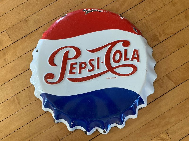
My grandfather’s garage had an old Pepsi thermometer with their 1950s bottle cap logo – a red, white and blue circular design that screamed mid-century Americana. That classic emblem, with its distinctive swirled text and crown-like appearance, defined the brand during the post-war boom.
Pepsi has undergone numerous redesigns since, gradually flattening and simplifying their logo. The current minimalist circle barely resembles the ornate, detailed bottle cap that once adorned soda fountains nationwide.
What makes this evolution fascinating is seeing how a brand gradually shed its decorative elements while maintaining recognition. Each iteration became progressively sleeker, yet I can’t help missing that charming vintage complexity that perfectly captured the optimistic spirit of 1950s America.
11. MTV’s Graffiti-Style Revolution
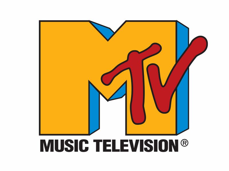
I vividly remember staying up late to catch music videos on MTV, mesmerized by that chunky, spray-painted ‘M’ with ‘TV’ stacked on top. Designed by Manhattan Design in 1981, this rebellious logo perfectly captured the channel’s revolutionary spirit.
What made this emblem special was its chameleon-like quality – it constantly changed colors and textures while maintaining its distinctive shape. The logo embodied MTV’s promise to shake up entertainment with the same irreverent energy that defined early rock videos.
Today’s sleek, monochromatic MTV logo lacks that raw, defiant quality that made the original so magnetic. I miss how that graffiti-inspired design screamed ‘counterculture’ in an era when cable television was still finding its voice.
12. Windows’ Flying Window Panes
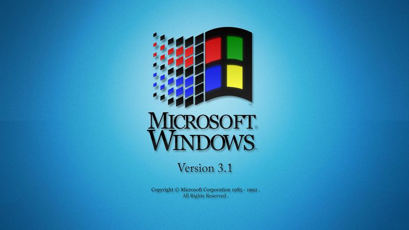
My first computer ran Windows 3.1, and I’d watch, transfixed, as those colorful window panes flew across the screen during startup. Microsoft’s 1992 logo featured four quadrants in red, green, blue and yellow, creating a literal window that seemed to flutter across your monitor.
This playful design captured the revolutionary idea of ‘windows’ on a computer screen. The logo’s movement suggested speed and dynamism, perfectly representing the exciting new world of home computing.
Microsoft’s current logo maintains the four-pane concept but with static, flat design principles. Gone is that sense of motion and wonder that made the original so captivating to young computer users like me, experiencing the magic of personal computing for the first time.
13. Atari’s Futuristic Mountain Peak
My uncle’s basement still houses an Atari 2600 with that incredible three-pronged logo emblazoned on it. Created in 1972, Atari’s emblem resembled a stylized ‘A’ with three lines extending outward, meant to represent Mount Fuji – though I always saw it as a spaceship beam!
This symbol perfectly captured the futuristic optimism of early video gaming. The simple, bold design looked equally at home on arcade cabinets and home consoles, becoming shorthand for technological entertainment.
While Atari still exists, their original logo has become more of a nostalgic symbol than an active brand. I can’t help feeling a twinge of joy whenever I spot that distinctive shape on retro merchandise, instantly transporting me back to the pioneering days of digital play.
14. Nickelodeon’s Splat That Defined A Generation
Saturday mornings in my childhood meant one thing: cartoons under that orange splat logo! Nickelodeon’s iconic ‘splat’ design, introduced in 1984, was deliberately messy and chaotic – the perfect visual representation of kids’ entertainment.
The irregular orange blob with the network name scrawled across it broke every rule of corporate design. It was unpredictable, loud, and slightly gross – everything kids loved and parents tolerated.
When Nick switched to a simpler, cleaner logo in 2009, something magical was lost. The current bubble-letter design is perfectly fine, but it lacks that rebellious spirit that made the original so special. That splat wasn’t just a logo; it was a declaration that this was television made specifically for kids, not watered-down adult content.
15. NBC’s Proud Peacock Display
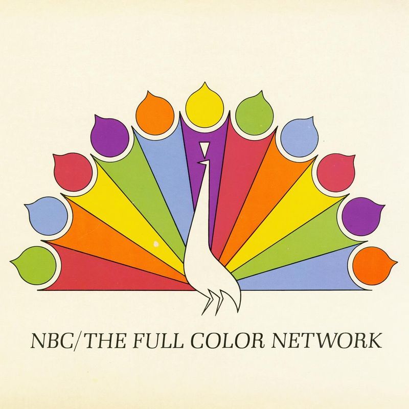
I’d always wait for NBC’s colorful peacock to unfurl its feathers before my favorite shows. Introduced in 1956 to promote color television, the NBC peacock was a technological marvel – showing viewers the full spectrum their new color TVs could display.
The original design featured a stylized bird with 11 feathers in different colors. Each feather represented a division of NBC, while simultaneously showcasing the rainbow of hues now available to viewers.
Today’s simplified peacock maintains the concept but lacks the grandiose presentation of its predecessor. Gone is the ceremonial unfurling that once signaled quality programming was about to begin. That proud, full-feathered display perfectly captured the wonder of color broadcasting – a technological miracle we now take completely for granted.
16. Shell’s Detailed Seashell Evolution

On road trips with my dad, I’d always look for the detailed Shell gas station signs – actual drawings of scallop shells with intricate ridges and shadowing. The petroleum giant’s earliest logos, dating back to 1900, were realistic depictions of shells, with detailed scientific accuracy.
Over decades, Shell gradually simplified their emblem, removing details while maintaining the basic shape. The transformation from realistic illustration to abstract symbol happened so gradually that many never noticed.
Today’s flat, simplified shell barely resembles its naturalistic ancestors. While undeniably more versatile for digital applications, I miss the craftsmanship of those early designs. There’s something charmingly authentic about a company whose logo actually looked like its namesake, rather than a stylized suggestion of one.
